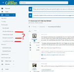
Just logged in here for the first time in ages (will be trying to search for clarity/comment elsewhere on Bailey's rumoured six month warranty extension amid the Covid thing) and immediately had to groan at the new look. Thankfully, this thread was one of the first things to leap out at me to read. Just like Facebook's new look ... everything splurged all over the screen yet with so so much wasted white space, and core detail confined to a bizarrely relatively narrow column down the middle of the screen. People asked for examples of what they didn't like yet they didn't seem too forthcoming (except from a chap called Hobbyt600 who evidently got 'banned' for his trouble??). My photo provides an obvious shortcoming or 'school boy error', concerning the text of the menus down the left hand side, needlessly truncated given all that wasted white space and, by all accounts at first glance, still an issue (or a new issue) 9 or 10 months on from relaunch?


